Linen Colors for Wedding Tables That Work
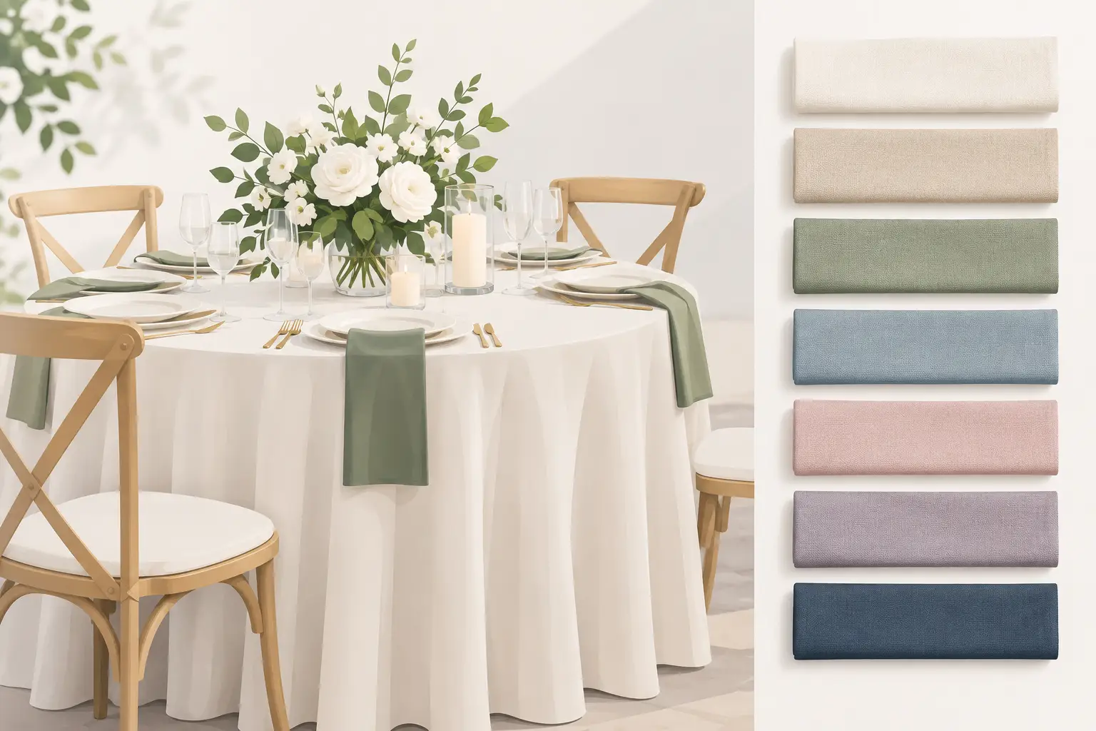
A reception can have beautiful flowers, great food, and a waterfront view, then still feel unfinished if the table linens fight the room. Choosing linen colors for wedding tables is not only about picking a favorite shade. It is about setting the backdrop for every centerpiece, place setting, candle, menu, and guest photo throughout the celebration.
For Central Florida weddings, the setting matters even more. A linen that looks perfect in a formal ballroom may feel too heavy under a clear-top tent in New Smyrna Beach. A pale color that works beautifully at sunset can become hard to define in bright afternoon light. The best choice balances your wedding style with the venue, lighting, season, rental chairs, dinnerware, and the practical realities of an outdoor event.
Start With the Room, Not the Swatch
Couples often begin with their wedding palette, then try to force it onto every table. A more reliable approach is to look at the venue first. Consider the floor, walls, chairs, tent fabric, natural surroundings, and available lighting. These are the large visual elements your linens need to work with.
White, ivory, champagne, and soft neutrals are flexible choices because they adapt to nearly any venue. They also give flowers, colored glassware, and specialty napkins room to stand out. This does not make neutral linens boring. Texture, layering, and a well-chosen napkin color can make a neutral table feel formal, coastal, romantic, or modern without overwhelming the room.
For a beachside or outdoor Florida wedding, sandy beige, ivory, pale blue, sage, dusty rose, and soft gray often look natural against water, palms, and warm evening light. In a venue with dark flooring or exposed wood, a lighter floor-length linen can brighten the room and make the table arrangement feel more intentional.
If your reception is in a bright white tent, there is more flexibility. Deep navy, forest green, burgundy, and black can create contrast, especially for evening events. The trade-off is that dark linens absorb light. Plan enough lighting so guests can comfortably read menus, see their meal, and enjoy the table details after sunset.
Linen Colors for Wedding Tables by Style
Your wedding style should guide the direction, but it does not have to dictate one matching color across every surface. Most polished receptions use a main linen color, then bring in contrast through napkins, runners, overlays, chargers, florals, or chair accents.
Classic and Formal
For black-tie, traditional church, or ballroom weddings, white, ivory, champagne, silver, and black remain dependable choices. White linens with black napkins or dark chargers create crisp contrast. Ivory paired with champagne or gold details gives a softer, warmer result.
Avoid mixing bright white and ivory without a reason. Under certain lighting, ivory may appear yellow next to a true white linen. If both are part of the design, separate them by using one on guest tables and the other in florals or stationery rather than placing them side by side.
Coastal and Garden-Inspired
Soft, sun-washed colors tend to suit beach, backyard, garden, and tented receptions. Think sand, sea glass green, misty blue, muted coral, blush, and natural linen tones. These colors can feel relaxed while still looking elevated when paired with clean dinnerware and thoughtful centerpieces.
A coastal palette does not require turquoise tablecloths or seashells on every table. Often, an ivory tablecloth, dusty blue napkin, and a few natural textures create a more timeless coastal look. This approach also photographs well as daylight shifts from bright afternoon to warm sunset.
Modern and Minimal
Modern receptions often rely on contrast and restraint. White or black linens, charcoal, taupe, or a single saturated accent color can make a strong statement. Consider black linens with clear or white dinnerware for an evening reception, or crisp white linens with a deep green napkin for a clean, tailored look.
With a minimal design, every detail is more visible. Wrinkled linens, uneven table sizes, or mismatched chair colors stand out quickly. Build in enough setup time for tables to be dressed properly and for specialty pieces to be placed with care.
Romantic and Color-Forward
For couples using a fuller color palette, the safest move is usually to keep the tablecloth neutral and introduce color in smaller layers. Blush, mauve, terracotta, lavender, sage, and dusty blue all work well as napkin or runner colors. This gives your floral designer more freedom and prevents the tables from looking overly coordinated.
A colored tablecloth can be the right choice when the color is central to the wedding design, especially for a head table, cake table, sweetheart table, or cocktail table. Use it selectively if you are unsure. One feature table can carry a rich color without making the whole reception feel dark or busy.
Choose a Base Color and One Supporting Accent
A simple color plan is easier to execute than a palette with five competing shades. Begin with the base linen, which covers most guest tables. Then choose one supporting color for napkins, runners, or select specialty tables. Metallic accents from chargers, flatware, candleholders, or vases can provide another layer without adding a new fabric color.
For example, ivory guest-table linens with sage napkins and gold details feel warm and refined. White linens with navy napkins and clear glassware are clean and classic. Sand-colored linens with dusty blue napkins can feel especially appropriate for a waterfront reception without becoming theme-heavy.
Consider where the color will appear across the room. A single dark head table placed at the far end of an otherwise light reception can anchor the space. Alternating linen colors on every guest table, however, can become visually choppy unless the venue is large enough to support the pattern.
Test Colors in Real Lighting
Fabric swatches are useful, but they are not a final answer. View the colors where and when the reception will take place whenever possible. Morning sun, late afternoon sun, market lights, chandeliers, and colored uplighting can change the appearance of fabric dramatically.
This is especially relevant for Florida outdoor weddings. Bright sunlight can make pale blush read nearly white, while navy may look almost black after sunset. If the ceremony and reception cross from daylight into evening, choose colors that look good in both conditions rather than relying on one perfect moment.
Bring together a small sample group: the linen color, napkin, invitation, floral reference, charger or plate, and a photo of the chairs. You do not need to match every item exactly. You are checking whether the undertones agree. Warm ivory, peach roses, and gold details belong together more naturally than cool gray linens, cream flowers, and bright silver accents.
Match Linen Size and Texture to the Table
Color gets most of the attention, but size and fabric finish determine whether tables look polished. A properly sized linen should cover the table evenly and create the drop you want. Floor-length linens give formal guest tables and sweetheart tables a finished appearance. Mid-length linens can work well for casual events, dessert stations, buffet tables, and backyard celebrations where a less formal look fits the setting.
Texture can also change how a color reads. Matte polyester offers a clean, practical foundation and works for most wedding styles. Satin reflects light and can look more formal, but it may show wrinkles and fingerprints more easily. Sequins, velvet, and specialty overlays create impact on focal tables but are usually strongest in limited quantities.
Do not overlook the table shape. Round guest tables distribute linen color evenly through the room. Long banquet tables create a stronger visual line, making runners and contrasting napkins more noticeable. If you are mixing rounds and farm tables, use linens strategically so the room feels connected rather than pieced together.
Keep Food Service and Guest Comfort in Mind
A beautiful table still needs to function. White and ivory linens are forgiving for many menu styles, while very dark linens can show crumbs, flour, or light-colored sauces during dinner service. Light linens can reveal red wine spills, so it depends on whether the look or the lowest-maintenance option is the higher priority.
For buffet, cake, gift, and bar tables, choose linen colors that support the event flow. A neutral buffet linen keeps food presentation front and center. A darker bar linen can hide the normal activity of beverage service. A specialty linen on the cake table helps turn it into a focal point without requiring elaborate décor.
If the event is outdoors, secure linens properly and account for wind. Long cloths are elegant, but they should not become a tripping concern around high-traffic areas. Tent sides, weighted décor, and a sensible floor plan can help keep the reception comfortable as conditions change.
A Reliable Way to Finalize Your Linen Plan
Before confirming your rental order, review your plan table by table. Identify guest tables, head or sweetheart tables, cake and gift tables, buffet tables, bar tables, and any highboy cocktail tables. Each area does not need a different color, but each should have a clear purpose within the overall design.
Paradise Event Rentals can help coordinate the practical pieces around your linen selection, including tables, chairs, dinnerware, glassware, bars, tents, and lighting. Having these elements considered together reduces last-minute mismatches and makes setup easier for everyone involved.
The right linen color is the one that supports the setting, flatters your other details, and still feels like your wedding when the lights come on. Pick a foundation you can trust, add color where it has the most impact, and leave room for the people, food, and celebration to be the real focus of the table.